
Lazy exploratory data analysis of Japan stock market from Kaggle competition
This is my Kaggle notebook copy which devoted to explanatory data analysis of Japan stock market. There are some small changes mostly referring to visual representation. It worth to mention that Kaggle uses pretty old R version and has limit set of packages that possible to use.
Damn I am so lazy 🥱
It’s seems 99% of working time my brain is searching for how make things simpler and more convenient. So I decided to share my EDA approach which full of tricks in order to make work done with less energy as possible.
Firstly let’s put some plan to skip unnecessary work:
- Check the data, find possible gaps
- Create tools that are needed for training model
- Check some hypotheses about market to finance relation
The first trick is to use as many ready tools as possible 🛠,
Let’s use following packages:
options(warn = -1) # suppress annoying warnings

library(data.table) # package for less typing  and faster data handling
library(magrittr) # pipes is always useful
library(openxlsx) # for lazy description preparation into excel
library(purrr) # for several useful function
library(ggplot2) # visualization package
library(patchwork) # extension for previous one
library(GGally) # ready to use visualization functions
library(DataExplorer) # ready to use data exploring functions
library(ggpp) # ggplot styling
library(stringi) # for working with strings
library(collapse) # nice package for many things but here I will use it only for getting some statistics
library(skimr) # for data profiling
library(scales) # actually it's needed for one ready to use function, see below
library(lubridate) # for time related handling
library(thematic) # theme package
library(DT) # table visualization

thematic_rmd(bg = "#1D1E20", accent = "cyan", fg = "grey90", font = font_spec("Roboto"), sequential = firatheme::firaPalette(100), qualitative = palette.colors(palette = "Tableau")) # standard blog theme
# sysfonts::font_add_google("Roboto")
my_pal <- palette.colors(palette = "Tableau") %>% unname() # standard blog theme
1. Check the data, find possible gaps
Let’s create file for convenient checking metadata as lazy as possible:
- Get all file paths
- Downloaded it to one environment object
- Write object to excel for convenient use
path2spec <- "data/jpx-tokyo-stock-exchange-prediction/data_specifications/"

spec_names <- list.files(path2spec, pattern = ".csv") %>% stri_replace(regex = "\\.csv", "")
hs <- createStyle(textDecoration = "BOLD", fontColour = "white", fontSize = 12, fontName = "Arial Narrow", fgFill = "gray20")

list.files(path2spec, full.names = TRUE, pattern = ".csv") %>%
  lapply(function(x)fread(x)) %>%
  set_names(spec_names) %>%
  write.xlsx(file = "data/spec.xlsx", headerStyle = hs)
Ok, now I may just download excel file and keep it in front of my eyes hence I may easily check metadata across tabs. Very lazy approach as I really like ✌️
Then let’s use train data as a main focus for exploration. Let’s download it as one large collection just because it’s convenient and need less typing ⌨️
path2train <- "data/jpx-tokyo-stock-exchange-prediction/train_files"

train_names <- list.files(path2train) %>% stri_replace(regex = "\\.csv", "")
train <- list.files(path2train, full.names = TRUE, pattern = ".csv") %>%
  lapply(function(x)fread(x)) %>%
  set_names(train_names)


datatable(train$stock_prices[1:100],  style = 'bootstrap4',  extensions = 'Responsive', options = list(pageLength = 10),
          caption = "Stock prices")
datatable(train$financials[1:100], style = 'bootstrap4',  extensions = 'Responsive', options = list(pageLength = 10),
          caption = "Financial reports")
Now let’s check whether has fread function guessed column type properly by compare with data description 🧐
lapply(train$stock_prices[1:100], class) %>%
  tibble::enframe() %>%
  datatable(style = 'bootstrap4',  extensions = 'Responsive', options = list(pageLength = 5),
            caption = "Stock price column types")
lapply(train$financials[1:100], class) %>%
  tibble::enframe() %>%
  datatable(style = 'bootstrap4',  extensions = 'Responsive', options = list(pageLength = 5),
            caption = "Financial reports column types")
More or less result looks nice but some of columns like NetSales and ResultDividendPerShareAnnual in financials are not correct 👎
I would fix it in case it needed for EDA further either before modeling during feature engineering. I still don’t intresting to do unnecessary work 😎
Let’s check stock price data as main focus 🔬
skim(train$stock_prices)
| Name | train$stock_prices |
| Number of rows | 2332531 |
| Number of columns | 12 |
| Key | NULL |
| _______________________ | |
| Column type frequency: | |
| character | 1 |
| Date | 1 |
| logical | 1 |
| numeric | 9 |
| ________________________ | |
| Group variables | None |
Table 1: Data summary
Variable type: character
| skim_variable | n_missing | complete_rate | min | max | empty | n_unique | whitespace |
|---|---|---|---|---|---|---|---|
| RowId | 0 | 1 | 13 | 13 | 0 | 2332531 | 0 |
Variable type: Date
| skim_variable | n_missing | complete_rate | min | max | median | n_unique |
|---|---|---|---|---|---|---|
| Date | 0 | 1 | 2017-01-04 | 2021-12-03 | 2019-07-05 | 1202 |
Variable type: logical
| skim_variable | n_missing | complete_rate | mean | count |
|---|---|---|---|---|
| SupervisionFlag | 0 | 1 | 0 | FAL: 2332001, TRU: 530 |
Variable type: numeric
| skim_variable | n_missing | complete_rate | mean | sd | p0 | p25 | p50 | p75 | p100 | hist |
|---|---|---|---|---|---|---|---|---|---|---|
| SecuritiesCode | 0 | 1.00 | 5894.84 | 2404.16 | 1301.00 | 3891.00 | 6238 | 7965.00 | 9.99700e+03 | ▅▇▆▇▆ |
| Open | 7608 | 1.00 | 2594.51 | 3577.19 | 14.00 | 1022.00 | 1812 | 3030.00 | 1.09950e+05 | ▇▁▁▁▁ |
| High | 7608 | 1.00 | 2626.54 | 3619.36 | 15.00 | 1035.00 | 1834 | 3070.00 | 1.10500e+05 | ▇▁▁▁▁ |
| Low | 7608 | 1.00 | 2561.23 | 3533.49 | 13.00 | 1009.00 | 1790 | 2995.00 | 1.07200e+05 | ▇▁▁▁▁ |
| Close | 7608 | 1.00 | 2594.02 | 3576.54 | 14.00 | 1022.00 | 1811 | 3030.00 | 1.09550e+05 | ▇▁▁▁▁ |
| Volume | 0 | 1.00 | 691936.56 | 3911255.94 | 0.00 | 30300.00 | 107100 | 402100.00 | 6.43654e+08 | ▇▁▁▁▁ |
| AdjustmentFactor | 0 | 1.00 | 1.00 | 0.07 | 0.10 | 1.00 | 1 | 1.00 | 2.00000e+01 | ▇▁▁▁▁ |
| ExpectedDividend | 2313666 | 0.01 | 22.02 | 29.88 | 0.00 | 5.00 | 15 | 30.00 | 1.07000e+03 | ▇▁▁▁▁ |
| Target | 238 | 1.00 | 0.00 | 0.02 | -0.58 | -0.01 | 0 | 0.01 | 1.12000e+00 | ▁▇▁▁▁ |
Very nice! Some findings:
- ~2.3M rows but it’s not so large amount for
data.table💪 Open,Closeetc columns contains 7k missed rowsExpectedDividendcolumn has complete rate less than 0.1%
Now let’s check days with missed data
train$stock_prices[is.na(Open) | is.na(High), .(.N), by = "Date"][order(-N)][1:10] %>%
  datatable(style = 'bootstrap4',  extensions = 'Responsive', options = list(pageLength = 5),
            caption = "Dates with missed data sorted")
Well something has happened on 2020-10-01 obviously 🚨 It could be crash or trade cease. I guess it could be easily checked by googling but I too lazy for that. Do I really need to know which exactly disaster has happened for prediction modeling? Let’s check secondary stocks instead.
skim(train$secondary_stock_prices)
| Name | train$secondary_stock_pri… |
| Number of rows | 2384575 |
| Number of columns | 12 |
| Key | NULL |
| _______________________ | |
| Column type frequency: | |
| character | 1 |
| Date | 1 |
| logical | 1 |
| numeric | 9 |
| ________________________ | |
| Group variables | None |
Table 2: Data summary
Variable type: character
| skim_variable | n_missing | complete_rate | min | max | empty | n_unique | whitespace |
|---|---|---|---|---|---|---|---|
| RowId | 0 | 1 | 13 | 14 | 0 | 2384575 | 0 |
Variable type: Date
| skim_variable | n_missing | complete_rate | min | max | median | n_unique |
|---|---|---|---|---|---|---|
| Date | 0 | 1 | 2017-01-04 | 2021-12-03 | 2019-07-05 | 1202 |
Variable type: logical
| skim_variable | n_missing | complete_rate | mean | count |
|---|---|---|---|---|
| SupervisionFlag | 0 | 1 | 0.01 | FAL: 2370510, TRU: 14065 |
Variable type: numeric
| skim_variable | n_missing | complete_rate | mean | sd | p0 | p25 | p50 | p75 | p100 | hist |
|---|---|---|---|---|---|---|---|---|---|---|
| SecuritiesCode | 0 | 1.00 | 5227.29 | 2603.36 | 1305.00 | 3098.00 | 4845 | 7442.00 | 25935.00 | ▇▅▁▁▁ |
| Open | 91751 | 0.96 | 9251.52 | 50061.39 | 1.00 | 500.00 | 997 | 1968.00 | 906000.00 | ▇▁▁▁▁ |
| High | 91751 | 0.96 | 9330.41 | 50476.41 | 1.00 | 506.00 | 1006 | 1990.00 | 914000.00 | ▇▁▁▁▁ |
| Low | 91751 | 0.96 | 9170.18 | 49643.86 | 1.00 | 494.00 | 986 | 1943.00 | 905000.00 | ▇▁▁▁▁ |
| Close | 91751 | 0.96 | 9249.61 | 50060.05 | 1.00 | 500.00 | 997 | 1966.00 | 907000.00 | ▇▁▁▁▁ |
| Volume | 0 | 1.00 | 236468.71 | 2678571.41 | 0.00 | 1880.00 | 9500 | 48300.00 | 281835400.00 | ▇▁▁▁▁ |
| AdjustmentFactor | 0 | 1.00 | 1.00 | 0.16 | 0.10 | 1.00 | 1 | 1.00 | 200.00 | ▇▁▁▁▁ |
| ExpectedDividend | 2366117 | 0.01 | 166.41 | 980.83 | 0.00 | 0.00 | 4 | 16.50 | 15180.00 | ▇▁▁▁▁ |
| Target | 718 | 1.00 | 0.00 | 0.03 | -0.92 | -0.01 | 0 | 0.01 | 6.07 | ▇▁▁▁▁ |
Interesting 🤔
There are more missed rows in comparison with primary stocks. What is about dates?
train$secondary_stock_prices[is.na(Open) | is.na(High), .(.N), by = "Date"][order(-N)][1:20] %>%
  datatable(style = 'bootstrap4',  extensions = 'Responsive', options = list(pageLength = 5),
            caption = "Financial reports column types")
The same 2020-10-01 date related to complete trading stop. The rest of dates in sorted table fills in 2019 year. I suppose there should be some explanation of such case but I am not an expert in Japan stock market.
Then let’s create function for nice plotting of Target distribution. Pull out several parameters which would be convenient for plotting:
set_col- for setting focus columndrop_outliers- TRUE for dropping outliersbw- for setting proper bins of distribution
plot_stats <- function(dt, set_col, drop_outliers = FALSE, bw = .0008){
#set_col <- "Date"
by_col <- dt[, .(target_mean = mean(Target), target_sd = sd(Target)), by = set_col] %>%
melt(id.vars = set_col)
by_col_stats <- by_col[, .(median = median(value, na.rm = TRUE), mean = mean(value, na.rm = TRUE)), by = "variable"]
stats_tbl <- descr(dt[, .(target_mean = mean(Target), target_sd = sd(Target)), by = set_col])
if(drop_outliers) {
by_col <- by_col[, `:=` (iqr = IQR(value, na.rm = TRUE), q25 = quantile(value, .25, na.rm = TRUE), q75 = quantile(value, .75, na.rm = TRUE)), by = variable][value > q25 - iqr*1.5 & value < q75 + iqr*1.5]
}
p1 <- by_col %>%
ggplot(aes(x = value)) +
annotate("text_npc", npcx = .5, npcy = .5, label = "InvestCookies.ru", color = "#1D1E20", alpha = .9, size = 15) +
geom_histogram(binwidth = bw, alpha = .5) +
geom_vline(data = by_col_stats, aes(xintercept = mean, lty = "mean", col = "mean")) +
geom_vline(data = by_col_stats, aes(xintercept = median, lty = "median", col = "median")) +
geom_density(aes(y = after_stat(count*bw)), col = "firebrick", fill = "firebrick", alpha = .2) +
scale_linetype_manual(values = c(mean = 5, median = 2)) +
scale_color_manual(values = c(mean = "firebrick", median = "black")) +
facet_wrap(~variable, scales = "free", dir = "v") +
labs(title = stri_c("By ", set_col), lty = "stats", y = "count", col = "stats") +
theme(legend.position = "top")
p2 <- data.table(target_mean = stats_tbl$target_mean$Stats,
target_sd = stats_tbl$target_sd$Stats,
stat = names(stats_tbl$target_mean$Stats)) %>%
melt(id.vars = "stat") %>%
.[, stat := factor(stat, levels = c("N", "Ndist", "Mean", "SD", "Min", "Max", "Skew", "Kurt"), ordered = TRUE)] %>%
#dcast(variable ~ stat, value.var = "value") %>%
ggplot(aes(stat, variable)) +
geom_tile(fill = "#1D1E20", col = "gray70") +
geom_text(aes(label = round(value, 3)), col = "gray70") +
theme_minimal() +
theme(axis.text = element_text(size = 10, color = "gray70")) +
labs(x = "", y = "")
p1/p2 + plot_layout(heights = c(6, 1))
}
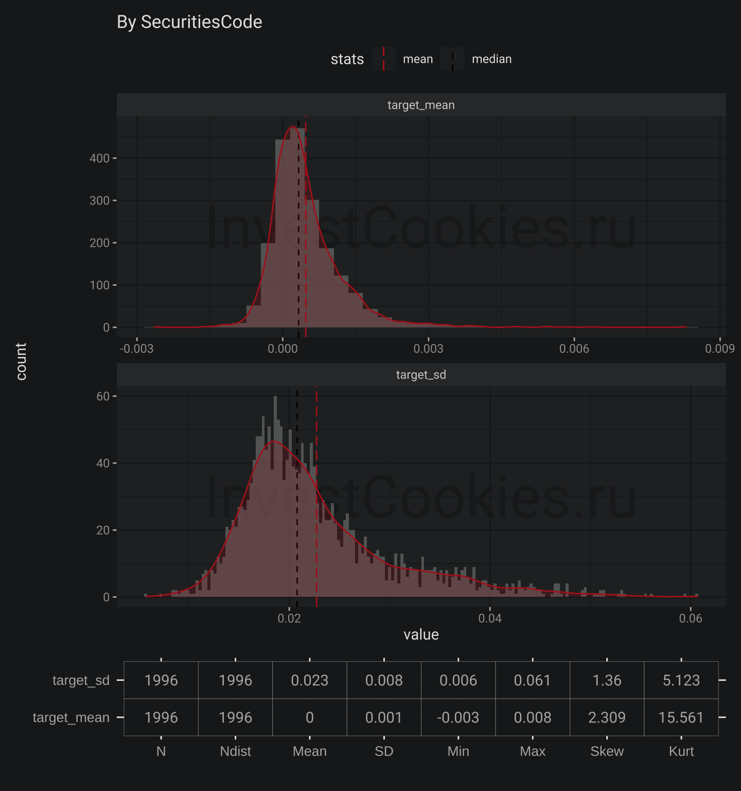
plot_stats(train$stock_prices, "Date") # let's plot grouped by Date

1.1 Date annotation
Mean
- Mean practically equals to zero which could be related to
Targetcalculation method - Skew is about the zero which means that changes more or less are symmetric for negative and positive target changes
- Kurt is more than zero that means that
Targethas more narrow distribution than normal one
SD
- Mean ~ 2.2 value means that there is some positive level of
Targetvariance and possibly it is not stable in time - Skew is essentially positive which means that
Targetvariance could increase on faster pace than decrease - Kurt is the same as for mean but more essential
Next check the same but grouped by SecuritiesCode using magic plotting function I created
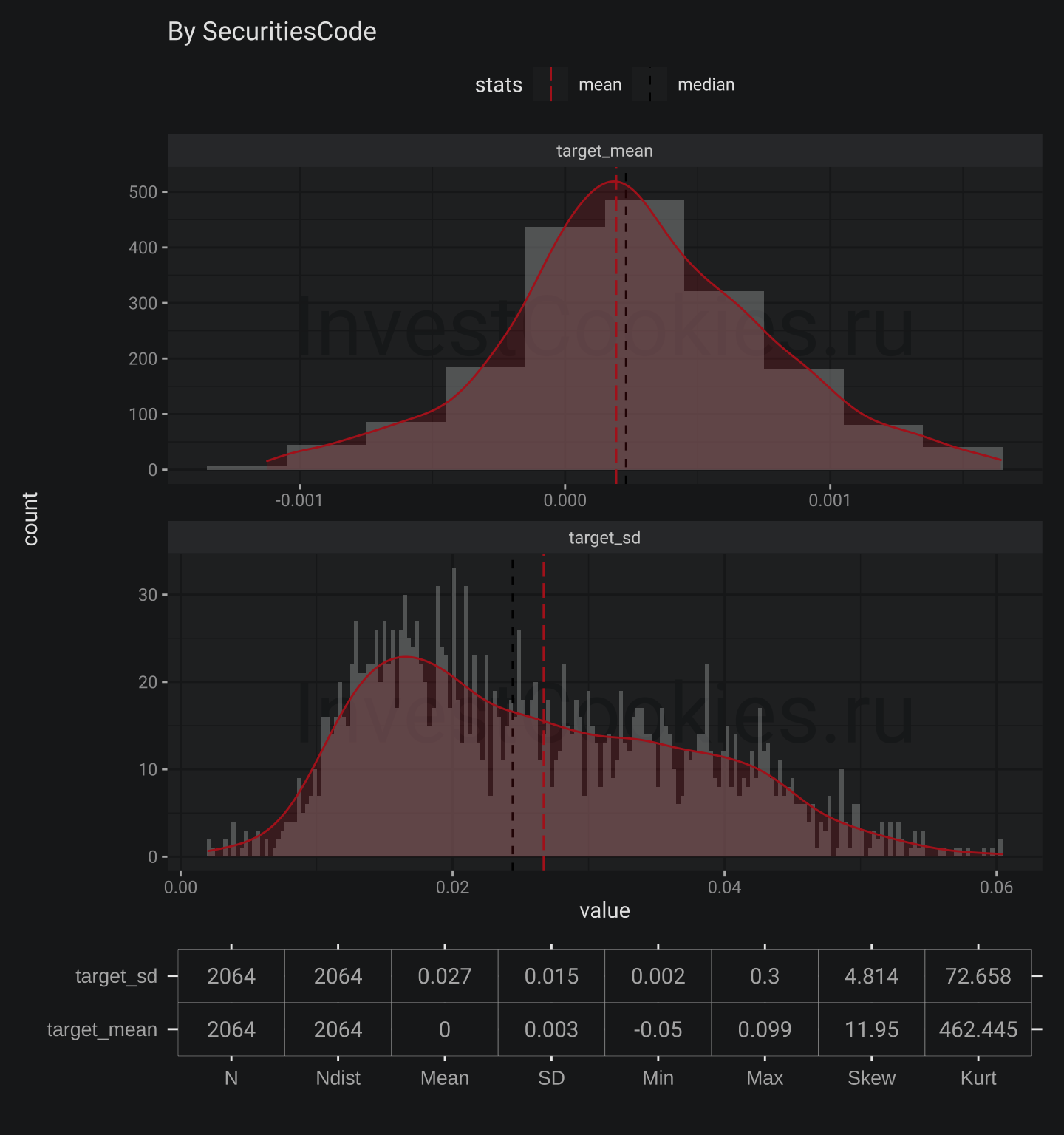
plot_stats(train$stock_prices, "SecuritiesCode", bw = .0003)
1.2 SecuritiesCode annotation
There is similar situation but Skew for Target mean is positive. This means that more probable to find company with higher level Target than with lower one. Next plots are for secondary stocks. I would leave it without comments.
plot_stats(train$secondary_stock_prices, "Date")

plot_stats(train$secondary_stock_prices, "SecuritiesCode", drop_outliers = TRUE, bw = .0003)
2. Create tools that are needed for training model
This section is devoted for creating function necessary for Sharpe ratio calculation. I am continiunig to practice in lazieness. That the reason why I just translate ready Python function to R’s one using description. I copied some reference below
Kaggle description
JPX Competition Metric
In this competition, the following conditions set will be used to compete for scores.
- The model will use the closing price (C_{(k, t)}) until that business day (t) and other data every business day as input data for a stock (k), and predict rate of change (r_{(k, t)}) of closing price of the top 200 stocks and bottom 200 stocks on the following business day (C_{(k, t+1)}) to next following business day (C_{(k, t+2)})
$$ r_{(k, t)} = \frac{C_{(k, t+2)} - C_{(k, t+1)}}{C_{(k, t+1)}} $$
- Within top 200 stock predicted (up_{i}(i = 1, 2, , 200)), multiply by their respective rate of change with linear weights of 2-1 for rank 1-200 and denote their sum as (S_{up}).
$$ S_{up} = \frac{\sum^{200}_{i=1}(r_{({up_i}, t)} * linear function(2, 1)_i))}{Average(linear function(2, 1))} $$
- Within bottom 200 stocks predicted (down_{i}(i = 1, 2, , 200)), multiply by their respective rate of change with linear weights of 2-1 for bottom rank 1-200 and denote their sum as (S_{down}).
$$ S_{down} = \frac{\sum^{200}_{i=1}(r_{({down_i}, t)} * linear function(2, 1)_i)}{Average(linear function(2, 1))} $$
- The result of subtracting (S_{down}) from (S_{up}) is (R_{day}) and is called “daily spread return.”
$$ R_{day} = S_{up} - S_{down} $$
- The daily spread return is calculated every business day during the public/private period and obtained as a time series for that period. The mean/standard deviation of the time series of daily spread returns is used as the score. Score calculation formula - x is the business day of public/private period
$$ Score = \frac{Average(R_{day_1-day_x})}{STD(R_{day_1-day_x})} $$
- The Kagger with the largest score for the private period wins.
The following rules are used to determine which stocks are available for investment.
-
The top 2,000 common stocks by market capitalization that have been listed for at least one year as of 2021-12-31 are eligible for investment.
-
If a stock is designated as Securities Under Supervision or Securities to Be Delisted during the private period, it will be excluded from investment after the date of designation.
-
When calculating the score, the adjusted stock price is used.
Intentions of problem
In general, it is not possible to assume that data will have the same distribution permanently in two different periods of financial market time-series data. For example, the nature of the market changed dramatically between February 2020 and March 2020 and beyond due to changes in global conditions caused by COVID-19 and other factors.
In the case of a competition that focuses on a financial market with shifting data distribution characteristics, we thought that the winner of the competition should be the Kaggler who constructed a robust model that does not depend on changes in the data distribution.
Based on the above assumptions, the following were considered in the design of this competition
-
The number of stocks to be forecast each business day is the difference between the rate of change of 200 stocks, each of which is 10% or more than the number of stocks to be invested in - 2000 stocks, so that the performance of the model can be competed without being affected by the events of individual stocks. In practice, however, institutional investors and funds often invest in 50-100 stocks, so there is a slight deviation from the real-world setting of the problem.
-
When calculating the daily spread return, a linear weight of 2 to 1 is applied to the 1-200 stocks, so that stocks with higher rates of return are placed in the first position.
-
Since “risk control” is also an important element of investment, the competing score is the mean/standard deviation of the time series of daily spread returns, rather than the simple mean or sum of daily spread returns. This makes it necessary to build a model that can respond to changes in the distribution of data and produce stable and high performance, rather than a model that only wins big on certain days.
-
The competition also provides option data and other data that can provide clues for estimating the volatility and risk factors of the market itself. These data may be used for more sophisticated risk control. Since the bottom 200 stocks are also included in the forecast, it is possible to adopt a market-neutral strategy - it is also possible to intentionally bias the beta toward the long side.
This is a pretty interesting metric which focuses on possible trading operation:
- Open short position which means stocks borrowing
- Open long position which means just stocks buy
I would figure out how such metric will behave in case when all stocks will grow or all stocks will fall. Such situation is very very rare but it’s still possible. In that case resulting value will be decreased because (S_{up}) - could be negative and (S_{down}) could be positive that means prediction model could show good opportunity for buying all stocks but evaluation metric will be not so good. I would suggest to add one more step for calculation which will include checking positive/negative return for 200 top/bottom stocks.
2.1 First version of Target calculation
First of all let’s calculate Target using formula [1]
train$stock_prices[, `:=`(close_lag1 = shift(Close, -1), close_lag2 = shift(Close, -2)), by = "SecuritiesCode"][
  , target := (close_lag2 - close_lag1)/close_lag1][1:10]  %>%
  datatable(style = 'bootstrap4',  extensions = 'Responsive', options = list(pageLength = 5),
            caption = "Target calculation")
Looks great but let’s check the result my target with initial Target by control sum
train$stock_prices[!is.na(target), .(Target, target)] %>% colSums() %>% round(3)
##   Target   target
## 1021.396 2194.473
Unfortunately that is not correct 😭
I need dig deeper to understand the reason ⚙️
Let’s check the most severe differences:
copy(train$stock_prices)[!is.na(target), diff := Target - target][order(diff)][1:10]  %>%
  datatable(style = 'bootstrap4',  extensions = 'Responsive', options = list(pageLength = 5),
            caption = "Difference between calculated target and original one")
I seems something happened with SecuritiesCode == "7638" on 2019-09-25, so let’s check this as well.
train$stock_prices[SecuritiesCode == "7638" & Date > as.Date("2019-09-18")][1:10]  %>%
  datatable(style = 'bootstrap4',  extensions = 'Responsive', options = list(pageLength = 10),
            caption = "SecuritiesCode 7638")
Now it’s clear that some of Securities could experience something like resizing which related to AdjustmentFactor column 📐
2.2. Second version of Target calculation
So let’s fix my initial calculation by adding expression with shift(AdjustmentFactor, -1) and then check the result
train$stock_prices[, `:=`(close_lag1 = shift(Close, -1)*shift(AdjustmentFactor,  -1), close_lag2 = shift(Close, -2)), by = "SecuritiesCode"][
  , target := (close_lag2 - close_lag1)/close_lag1]

train$stock_prices[!is.na(target), .(Target, target)] %>% colSums() %>% round(3)
##   Target   target
## 1021.396 1021.400
It works 🎉
2.3. Rank calculation
The next step is to create rank columns which is pretty easy
train$stock_prices[, rank := frankv(target, ties.method = "first", order = -1) - 1, by = "Date"][1:5]  %>%
  datatable(style = 'bootstrap4',  extensions = 'Responsive', options = list(pageLength = 10),
            caption = "Rank calculation")
Nice but could I check result visually? Of cource I could
train$stock_prices[, .(max = max(rank), min = min(rank), qty = length(rank) - 1), by = "Date"] %>%
  ggplot(aes(x = Date)) +
  annotate("text_npc", npcx = .5, npcy = .5, label = "InvestCookies.ru", color = "#1D1E20", alpha = .9, size = 15) +
  geom_line(aes(y = qty, col = "Quantity", lty = "Quantity"), alpha = .1, size = 6) +
  geom_line(aes(y = max, col = "Max", lty = "Max")) +
  geom_line(aes(y = qty, col = "Quantity", lty = "Quantity")) +
  geom_line(aes(y = min, col = "Min", lty = "Min")) +
  scale_color_manual(values = c("Max" = my_pal[1], "Quantity" = my_pal[6], "Min" = my_pal[2])) +
  scale_linetype_manual(values = c("Max" = 1, "Quantity" = 3, "Min" = 1)) +
  labs(title = "Comparison max rank with quantity of stocks", y = "Max/Quantity", lty = "Calculation", col = "Calculation")
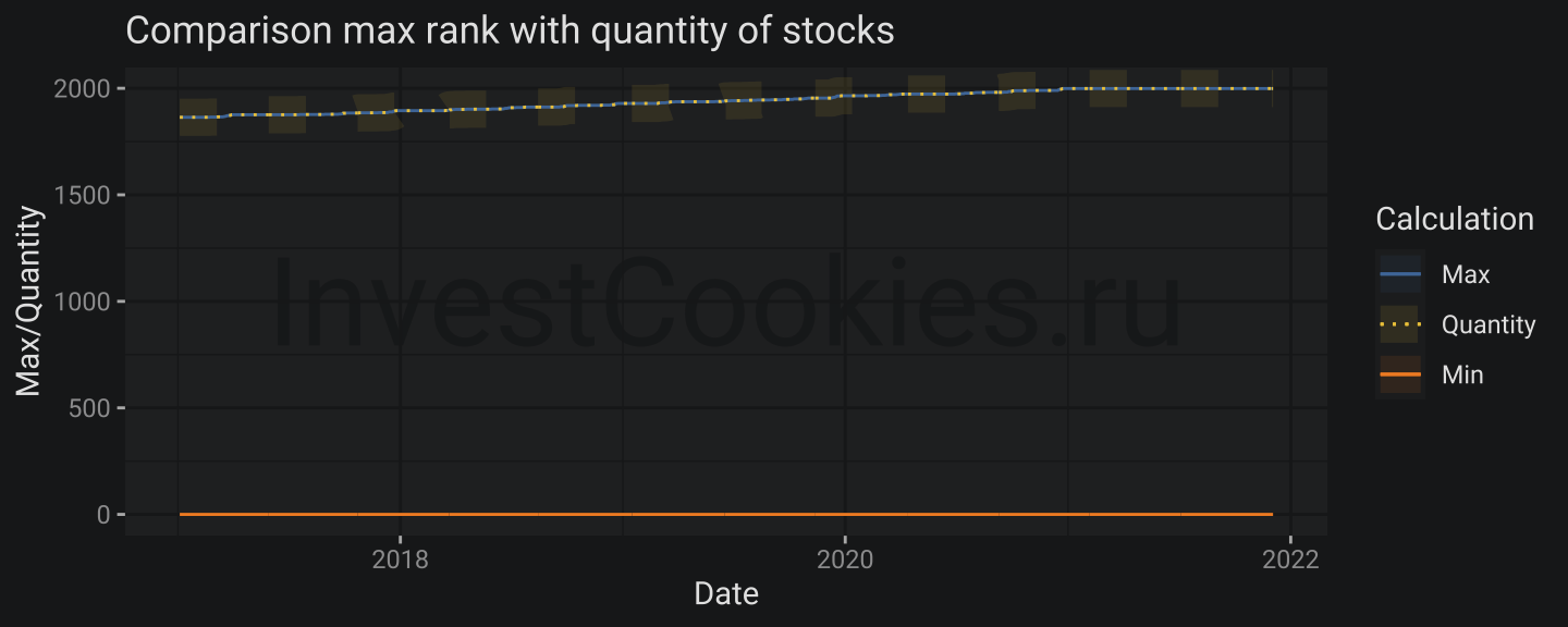
Result looks a bit strange but this plot is worth to comment. MIN and MAX ranks have no interruptions and MAX rank is slowly increasing due to IPOs emerged over time.
2.4. Sharpe fuction
Initial Python version of function is not optimized and it’s really possible to make things better but my brain is eager to save energy and I would leave it as is.
Worth to mentioned that I used scales::rescale() function in order to create linear function
get_sharpe <-  function(dt, portfolio_size = 200, top_rank = 2){

  get_day_return <- function(dt, portfolio_size, top_rank){
    if(min(dt$rank) != 0) stop("Minimal rank should be - 0")
    if(max(dt$rank) != length(dt$rank) - 1) stop("Maximum rank should be equal to length")

    stock_weights <-  rescale(seq_len(portfolio_size), to = c(top_rank, 1))
    purchase <- sum(dt[order(rank)][["target"]][1:portfolio_size]*stock_weights)/mean(stock_weights)
    short <- sum(dt[order(-rank)][["target"]][1:portfolio_size]*stock_weights)/mean(stock_weights)

    purchase - short
  }

  profit <- split(dt, by = "Date") %>%
    lapply(function(x)get_day_return(dt = x, portfolio_size = portfolio_size, top_rank = top_rank) %>% data.table(day_return = .)) %>%
    rbindlist(idcol = "Date")
  #debug(get_day_return)
  mean(profit$day_return)/sd(profit$day_return)
}

train$stock_prices[!is.na(target)][, year := year(Date)] %>%
           split(by = "year") %>%
           lapply(get_sharpe)
## $`2017`
## [1] 5.965199
##
## $`2018`
## [1] 5.024017
##
## $`2019`
## [1] 4.98389
##
## $`2020`
## [1] 3.792298
##
## $`2021`
## [1] 5.762568
Now there is R version of Sharpe function.
3. Check some hypotheses about market to finance relation
I could say that I am pretty experienced investor since I’ve been trading stocks for about ten years with positive return. When I am going to make a decision about buy/sell I am always interested in understanding relation between stock price moves and economic fundamentials. I am used to stick to simple impact chain in my considerations: Assets -> Revenue -> Profit -> Dividends -> Market Capitalization. On one side this logic is solid but it hardly covers all aspects of MarketCap on other side.
My plan for this section is following:
- Fix the data types that were previously detected
- Filter intermediate financial reports and leave only year reports
- Check for possible duplication and fix them
- Calculate Year by Year changes in financial reports
- Calculate Year by Year stock price return
- Check relations between Year by Year price return and Year by Year changes in financial reports
3.1. Fix the data types:
- Get all “Int64” and “float” types from data description in vector form named
fin_numbecause I am not going to change types manually 😎 - Set proper type for
fin_numcolumns - Replace empty values
""with more appropriateNAfor character columns
price_eda <- train$stock_prices
fin_eda <- train$financials

fin_spec <- fread("data/jpx-tokyo-stock-exchange-prediction/data_specifications/stock_fin_spec.csv")
fin_num <- fin_spec[Type %in% c("Int64", "float")][["Column"]]
fin_char <- lapply(fin_eda, function(x)is.character(x)) %>% keep(~.x == TRUE) %>% names()

fin_eda[, (fin_num) := lapply(.SD, function(x)as.numeric(x)), .SDcols = fin_num][
  , (fin_char) := lapply(.SD, function(x)replace(x, x == "", NA)), .SDcols = fin_char]

fin_eda[1:200]  %>%
  datatable(style = 'bootstrap4',  extensions = 'Responsive', options = list(pageLength = 10),
            caption = "Financial reports fixed")
Great 👍
3.2. Filter intermidiate financial reports and leave only year reports
I would like to check relations between values aggregated by year for several reasons:
- Year is pretty long period for be sure that good finance report will impact prices
- Many companies used to issue only one report per year
Approach could be follow:
- Filter for reports which have name like
FYFinancialStatements_ - Check the number of rows for each
yearandSecuritiesCode - Just throw out duplicates in case I detect such
focus_fields <- c("Profit", "NetSales", "TotalAssets", "EarningsPerShare", "ResultDividendPerShareAnnual", "ForecastDividendPerShareAnnual", "ForecastNetSales", "ForecastProfit")

fin_eda1 <- fin_eda[stri_detect(TypeOfDocument, regex = "FYFinancialStatements_")][
  , year := year(CurrentPeriodEndDate)][
    , N := .N, by = c("SecuritiesCode", "year")]

fin_eda1[N > 2][1:10] %>%
  datatable(style = 'bootstrap4',  extensions = 'Responsive', options = list(pageLength = 10),
            caption = "Financial reports uniquie by report type")
3.3. Check for possible duplication and fix them
There are duplications here, let’s deduplicate with unique()
fin_eda2 <- unique(fin_eda1[stri_detect(TypeOfDocument, regex = "FYFinancialStatements_")], by = c("SecuritiesCode", 'year', 'TypeOfDocument'))
nrow(fin_eda1) # unique by report type
## [1] 18786
nrow(fin_eda2) # unique by publication
## [1] 18451
308 rows are dropped out 🚮
3.4. Calculate Year by Year changes in financial reports
fin_eda3 <- fin_eda2[, N := .N, by = c("SecuritiesCode", "year")][
  !(stri_detect(TypeOfDocument, regex = "IFRS$") & N == 2)][ # give less priority for IFRS reports in case there are two reports with different standards
    , N := .N, by = c("SecuritiesCode", "year")][
      !(stri_detect(TypeOfDocument, regex = "NonConsolidated_JP$") & N == 2)][ # give less priority for NonConsolidate reports in case there are two reports possible
        , .SD, .SDcols = c(focus_fields, "SecuritiesCode", "year", "N")][
            , (stri_c(focus_fields, "_chng")) := lapply(.SD, function(x) (x - shift(x))/x), .SDcols = focus_fields, by = "SecuritiesCode"] # calculate changes

fin_eda3[1:100] %>%
  datatable(style = 'bootstrap4',  extensions = 'Responsive', options = list(pageLength = 10),
            caption = "Financial reports year by year changes")
3.5. Calculate Year by Year stock price return
Here I also will use price return ratio instead of absolute values
return_eda <- price_eda[, `:=` (qtr = quarter(Date), year = year(Date))][
  , .(return = (last(Close) - first(Close))/first(Close)), by = c("SecuritiesCode", "year")]

ggplot(return_eda, aes(x = return, fill = as.factor(year))) +
  annotate("text_npc", npcx = .5, npcy = .5, label = "InvestCookies.ru", color = "#1D1E20", alpha = .9, size = 15) +
  geom_histogram(bins = 100, alpha = .7) +
  facet_grid(year ~ ., scales = "free") +
  xlim(-2, 10) +
  geom_vline(xintercept = 0, lty = 5) +
  labs(title = "Year/Year price stock returns distributions", fill = "year")
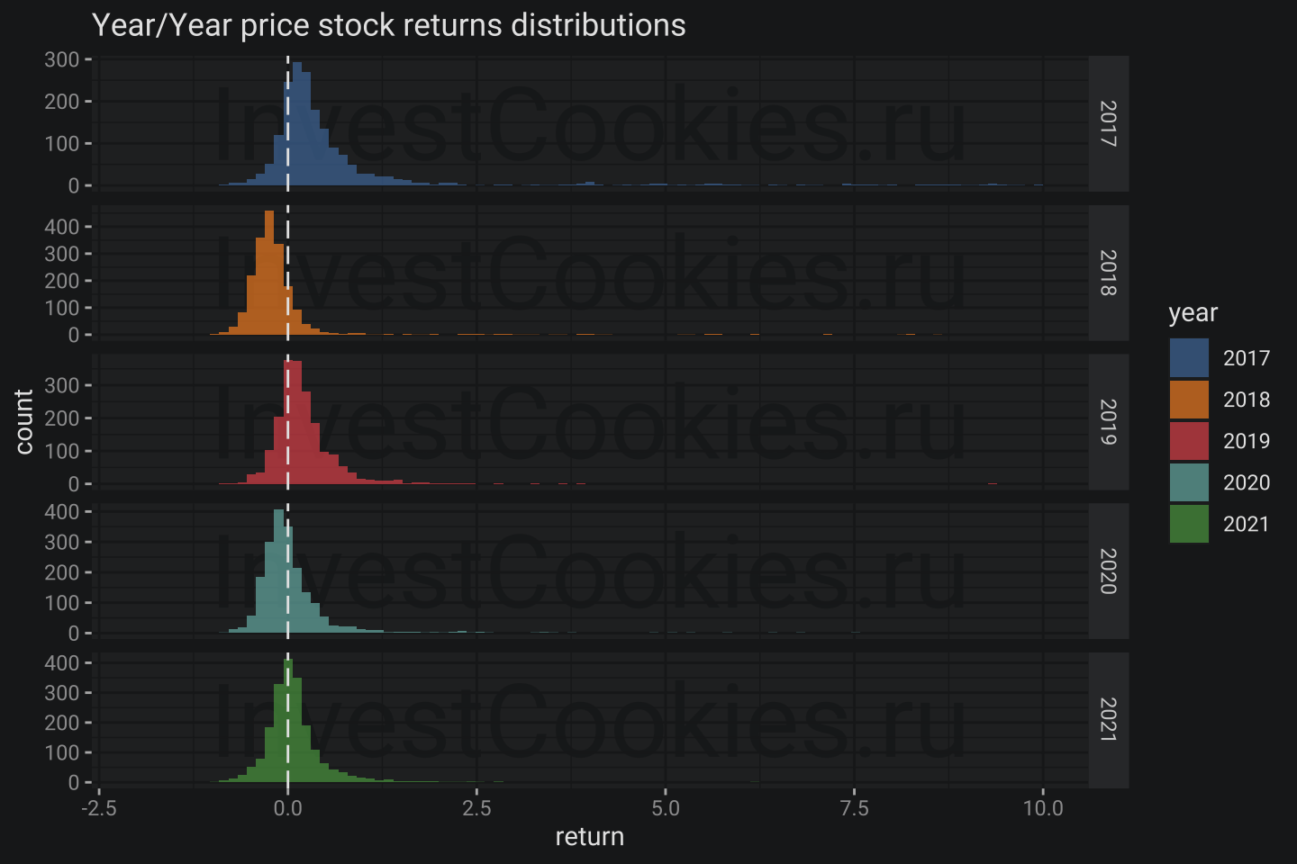
- It seems 2018 and 2020 years were not so happy for JPX investors
- Long long right tail shows rockets growths companies 🚀
qntls <- set_names(1:10/10, stri_c("q", 1:10, "0%"))
return_eda[, lapply(qntls, function(x)quantile(return, x, na.rm = TRUE) %>% round(3)), by = "year"] %>%
  datatable(style = 'bootstrap4',  extensions = 'Responsive', options = list(pageLength = 10),
            caption = "Stock return quantiles")
2017, 2019 and 2021 contains cases with thousands percent year growth 🚀
Interestingly there are no reverse cases even for weak 2018 and 2020. The weakest companies in q10% in weakest 2018 have only dropped on 50% but not more.
3.6. Check relations between Year by Year price return and Year by Year changes in financial reports
Create function which help to drop outliers drop_outliers. I would prefer to use something classical like interquartile range.
drop_outliers <- function(dt, field){
  vec <- dt[[field]]
  iqr <- IQR(vec, na.rm = TRUE)
  q25 <- quantile(vec, .25, na.rm = TRUE)
  q75 <- quantile(vec, .75, na.rm = TRUE)

  dt[get(field) > q25 - iqr*1.5 & get(field) < q75 + iqr*1.5]
}

return_eda1 <- return_eda[fin_eda3, on = .(SecuritiesCode, year)][
  complete.cases(fin_eda3) & !is.infinite(Profit_chng)& !is.infinite(NetSales_chng)][
    , year := as.factor(year)] %>%
  drop_outliers("Profit_chng") %>%
  drop_outliers("NetSales_chng") %>%
  drop_outliers("TotalAssets_chng") %>%
  drop_outliers("EarningsPerShare_chng") %>%
  drop_outliers("ResultDividendPerShareAnnual_chng") %>%
  drop_outliers("return")

return_eda1[1:200] %>%
  datatable(style = 'bootstrap4',  extensions = 'Responsive', options = list(pageLength = 10),
            caption = "Joint financial results and return")
Let’s plot correlation matrix using function from GGally package as kind of analog for covariance matrix in econometrics but visually more appealing
return_eda1[return < 2] %>%
  ggpairs(mapping = aes(color = year, fill = year),
          columns = c("Profit_chng", "NetSales_chng", "TotalAssets_chng", "EarningsPerShare_chng", "ResultDividendPerShareAnnual", "return"),           columnLabels = c("Profitg", "NetSales", "TotalAssets", "EarningsPerShare", "ResultDividend", "Return"),
          lower = list(continuous = wrap("smooth", alpha = 0.1)),
          diag = list(mapping = aes(alpha = .1)))

Some findings:
- Changes in TotalAsset drive changes in NetSale at ~40% of explained variance
- Change in NetSaledrive drive changes in Profit at ~32% of explained variance
- Change in Profit drive changes in ShareEarning at ~93% of explained variance
- Change in ShareEarning not drive changes in ResultDividend
- Return has no correlation with other columns
Worth to mention that correlation is not telling about causation but in that case I could be ruled by fundamental logic chain I mentioned above. Next I would check whether forecast version of financial indicators impacts return or not 🥸
return_eda2 <- return_eda[fin_eda3, on = .(SecuritiesCode, year)][
  complete.cases(fin_eda3) & !is.infinite(Profit_chng)& !is.infinite(NetSales_chng)][
    , year := as.factor(year)] %>%
  drop_outliers("ForecastDividendPerShareAnnual_chng") %>%
  drop_outliers("ForecastNetSales_chng") %>%
  drop_outliers("ForecastProfit_chng") %>%
  drop_outliers("return")

return_eda2[return < 2] %>%
  ggpairs(mapping = aes(color = year, fill = year),
          columns = c("ForecastDividendPerShareAnnual_chng", "ForecastNetSales_chng", "ForecastProfit_chng", "return"),
          columnLabels = c("ForecastDividend", "ForecastNetSales", "ForecastProfit", "Return"),
          lower = list(continuous = wrap("smooth", alpha = 0.1)),
          diag = list(mapping = aes(alpha = .1)))
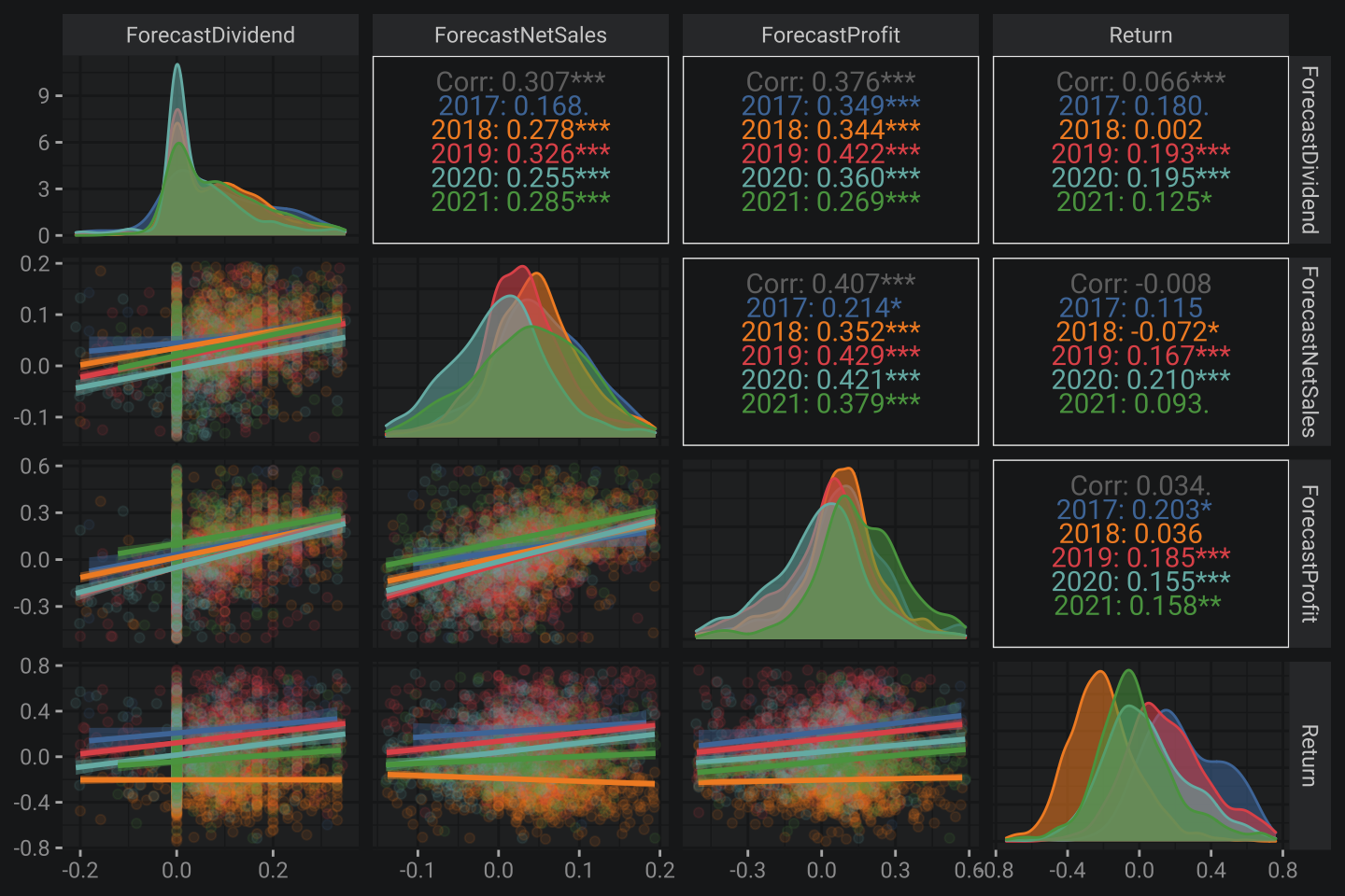
Overall situation is the same. Nothing changed 🙃
At last let’s check whether forecast correlates to actual values or not.
return_eda3 <- return_eda[fin_eda3, on = .(SecuritiesCode, year)][
  complete.cases(fin_eda3) & !is.infinite(Profit_chng)& !is.infinite(NetSales_chng)][
    , year := as.factor(year)] %>%
  drop_outliers("Profit_chng") %>%
  drop_outliers("NetSales_chng") %>%
  drop_outliers("ForecastNetSales_chng") %>%
  drop_outliers("ForecastProfit_chng")

return_eda3[return < 2] %>%
  ggpairs(mapping = aes(color = year, fill = year),
          columns = c("ForecastNetSales_chng", "ForecastProfit_chng", "NetSales_chng", "Profit_chng"),
          columnLabels = c("ForecastNetSales", "ForecastProfit", "NetSales", "Profit"),
          lower = list(continuous = wrap("smooth", alpha = 0.1)),
          diag = list(mapping = aes(alpha = .1)))
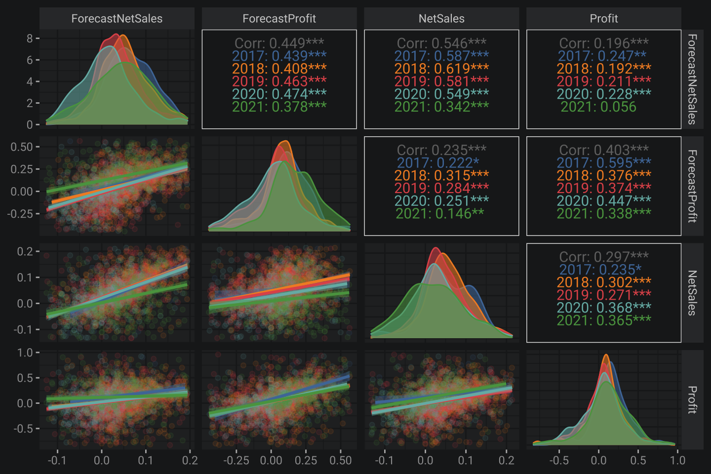
Some findings:
- NetSales correlates to forecasting version at ~54% of explained variance
- NetSales correlates to forecasting version at ~40% of explained variance
Not bad 😎
4. Overall key results
- There are a lot of equities has rocket growth but a limited few have experienced drastically fall
- 2018 and 2020 were weak but other years were pretty strong from my perspective
Targetcalculation should also considerAdjustmentFactor- Sharpe function in R published
- Equities return is hardly correlated with financial fundamental indicators
- The preciseness of forecasting Japan companies financials is about 50%
Simple way to be notified about new notes – subscribe Telegram-channel: